AQS Now, Data Visualization of Air Quality
Overview
AQS Now is a real-time data visualization platform focused on making air quality data accessible and actionable. The project takes live environmental data and translates it into interactive charts and dashboards that help users better understand the air they breathe. By leveraging JavaScript and Chart.js, the platform transforms complex datasets into engaging visuals, offering both clarity and insight.
Role
I did the UI/UX design and front-end development of the site. My responsibilities included designing the user interface in Figma, developing responsive layouts in HTML and CSS, and implementing dynamic data visualizations using JavaScript and Chart.js. I also handled API integration and built adaptive components to respond to real-time environmental data.
The Challenge
Design and develop a real-time data visualization platform using live environmental data. The goal of this project was to transform complex, continuously updating datasets into a user-friendly interface that communicates critical information clearly and interactively. The visualization should help users understand evolving trends, uncover insights, and make informed decisions—regardless of their technical background. The final product must be functional, visually engaging, and able to adapt dynamically to real-world data.
My Solution
AQS Now is a data visualization platform designed to provide real-time insights into Air Quality Standards (AQS) data. It utilizes the AQS Api, managed by the EPA, which allows my website to recieve real time data on Air Quality according to geographic location. By transforming complex environmental datasets into intuitive, interactive visualizations, AQS Now empowers users to understand and act on air quality trends quickly and effectively.
Objectives
- Dynamic Visualizations: The primary goal was to turn raw air quality data into clear, interactive visuals. Using tools like Chart.js, I designed charts, maps, and dashboards that allow users to engage with the data—hovering, filtering, and comparing pollutant levels over time and across regions. This level of interactivity transforms static numbers into meaningful stories about the air we breathe, helping users quickly grasp trends and patterns that might otherwise be overlooked.
- Real-Time Updates: Environmental conditions are constantly changing, and I wanted the platform to reflect that urgency. By integrating live data from the AirNow API, AQS Now automatically pulls in the most up-to-date information without the need for manual refreshes. This ensures users always have access to current AQI readings and pollutant breakdowns—making it a reliable resource for everyday awareness, research, or decision-making.
- User-Friendly Interface: From the beginning, I wanted AQS Now to be usable by both environmental experts and people with no prior experience interpreting air quality data. The interface emphasizes simplicity without sacrificing depth. Clear labeling, modular layouts, and responsive design principles ensure that users can navigate the platform effortlessly—whether they’re checking the air before a walk or analyzing regional trends for a larger environmental study.
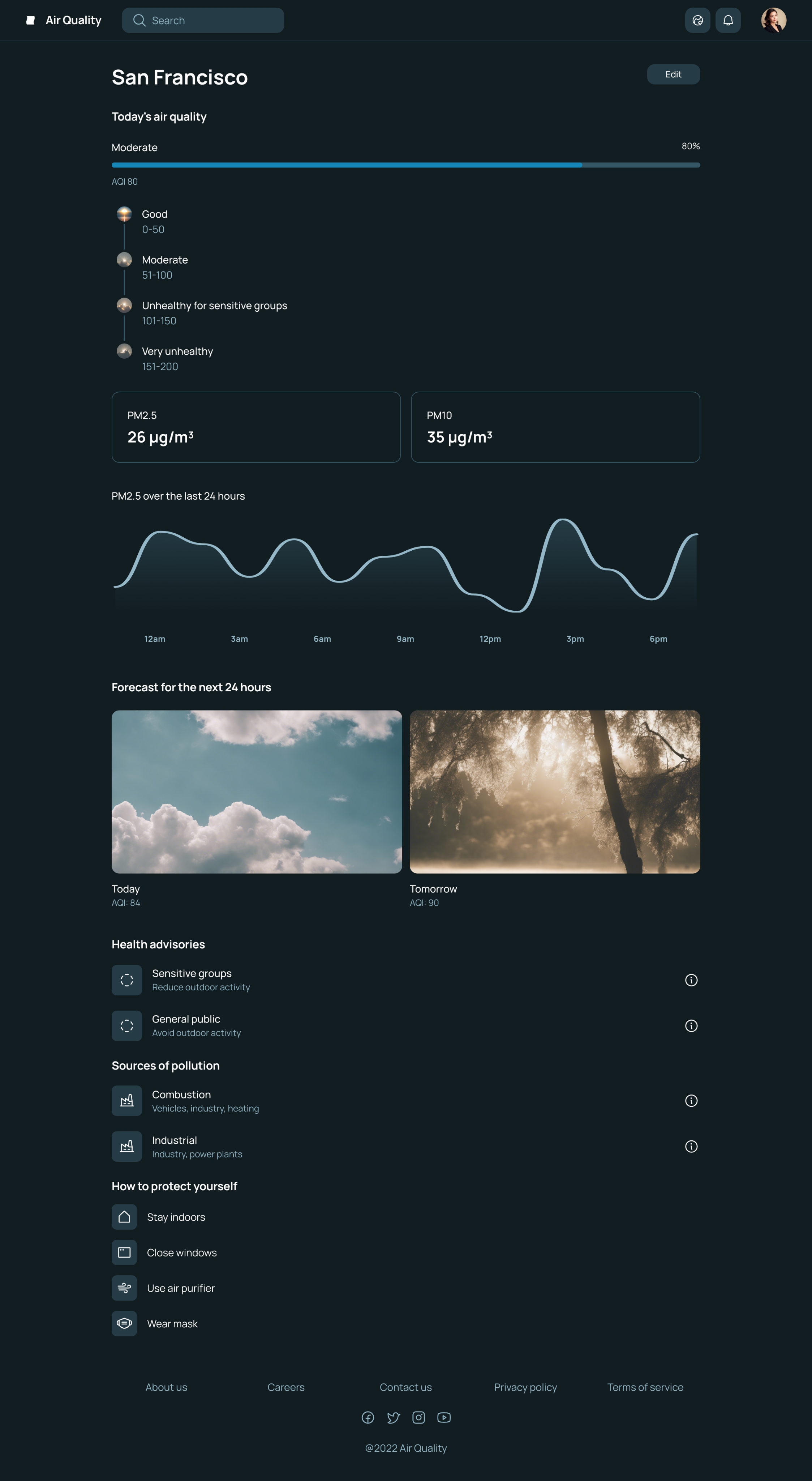
Early Visual Designs
Development
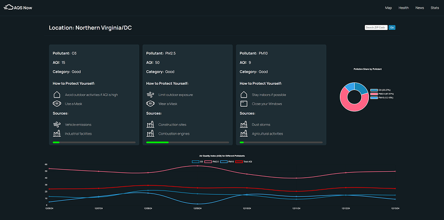
Moving into development, I began integrating the live air quality data through the AirNow API. At first, I expected the data to provide a single, unified Air Quality Index (AQI) score per location—a simple value to visualize and track. However, the reality was far more complex: the API returned separate AQI values for each individual pollutant, such as PM2.5, PM10, ozone, and nitrogen dioxide. Additionally, the number and types of pollutants reported varied significantly between regions and over time. This unexpected structure challenged my original design, which was built around visualizing just one overall score. Rather than forcing the data into a rigid layout, I decided to rework the platform to be more flexible and data-driven. I adapted the interface to display each pollutant independently, allowing users to see a breakdown of what’s actually in the air and how each element contributes to overall air quality. To support this dynamic approach, I implemented Chart.js, which gave me the flexibility to create clean, responsive visualizations that could scale with the data. I built a modular system that adjusts in real time—whether there are two pollutants or six, the layout updates to accommodate them, and each pollutant is displayed with its own AQI reading, color-coded according to severity. This phase of development reinforced the value of designing with the data instead of designing around assumptions. By embracing the complexity of environmental reporting, I was able to create a more informative and adaptive user experience—one that gives users insight not just into air quality, but into what is causing it and why it changes.
Screenshots from the Prototype to show how it had to be changed.
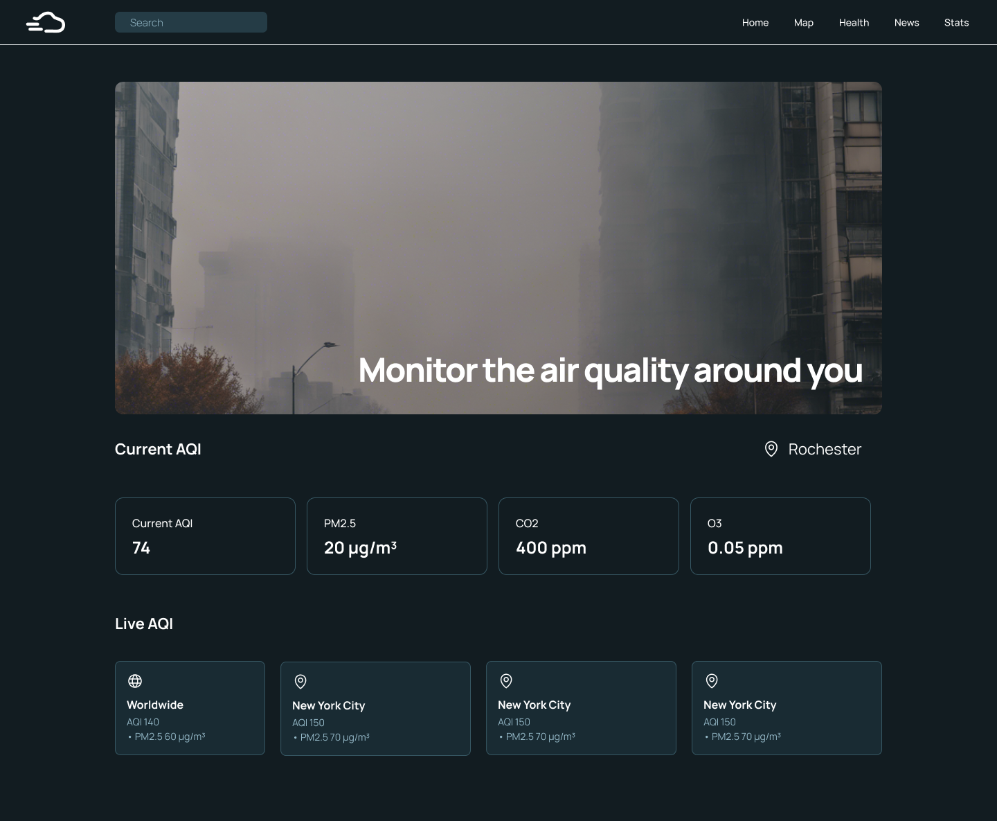
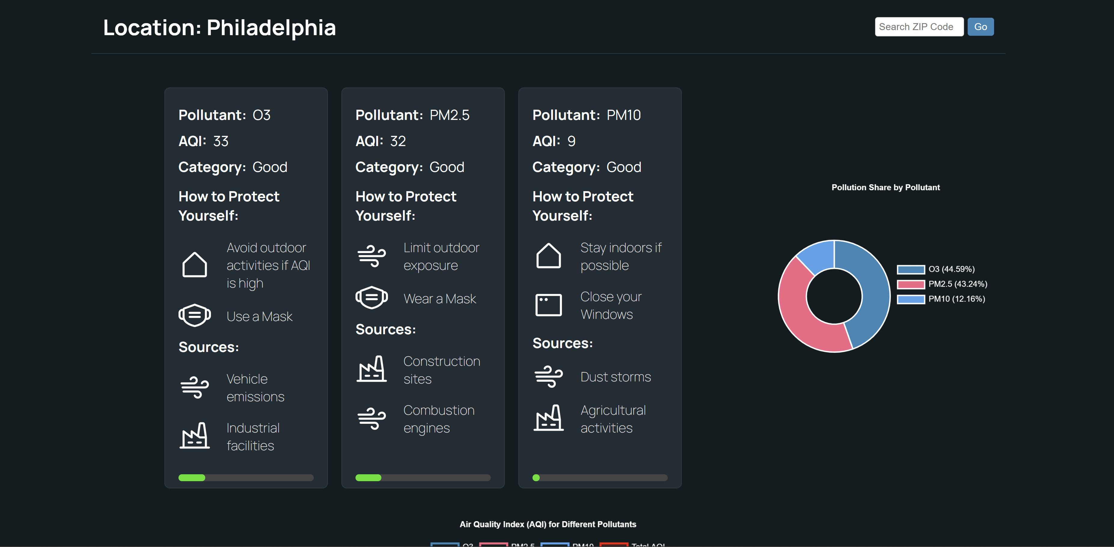
Final Prototype
The final product of AQS Now turned had to be altered due to the data stream from the Air Now API though I believe It was still executed well. Due to the tight timeframe I was unable to fully execute my visual comps for the sake of functionality, but AQS Now is still a polished, user-friendly platform that transforms complex air quality data into dynamic, interactive visualizations. The final product still features a clean, intuitive interface designed to make understanding Air Quality Standards (AQS) data simple and engaging for users of all backgrounds. With more time on this project I would refine the protypes visuals to match the visual comps, but the comps still show a possible strong visual execution.