Battle of the Buzzers – Capstone Project for The Strong National Museum of Play
Overview
This project was part of a capstone collaboration with The Strong National Museum of Play. Our team designed an interactive physical-digital game installation for the upcoming exhibit Beyond the Buzzer: Game Shows in America, blending projected visuals, touch interaction, and real-time feedback to create an accessible and engaging experience for all ages.
Role
I contributed to the overall UI/UX design of the experience, focusing on the onboarding kiosk and trivia screens. I collaborated closely with developers to ensure visual consistency, responsive screen behavior, and smooth transitions between physical and digital interactions.
The Challenge
Design an engaging and accessible physical-digital game show experience for Beyond the Buzzer: Game Shows in America, an upcoming exhibit at The Strong National Museum of Play. The goal was to create an installation that captures the excitement of classic American game shows, encourages playful movement, and seamlessly integrates with the exhibit’s broader RFID-based metagame. The experience needed to onboard users quickly, accommodate a wide age range, and deliver an intuitive UI that complemented both physical interaction and thematic storytelling.
Our Solution
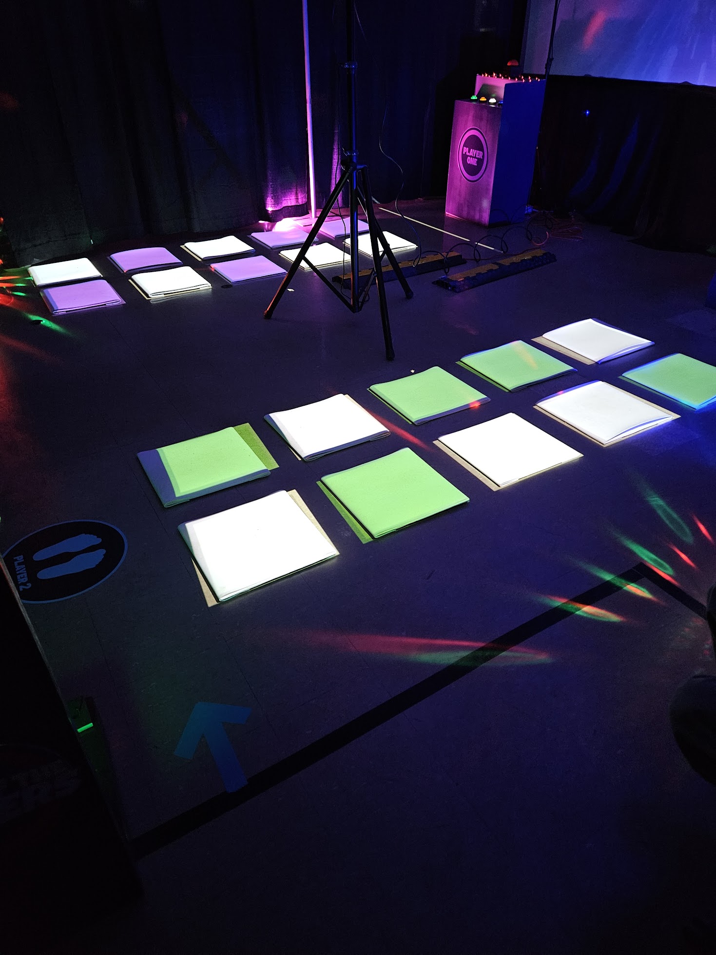
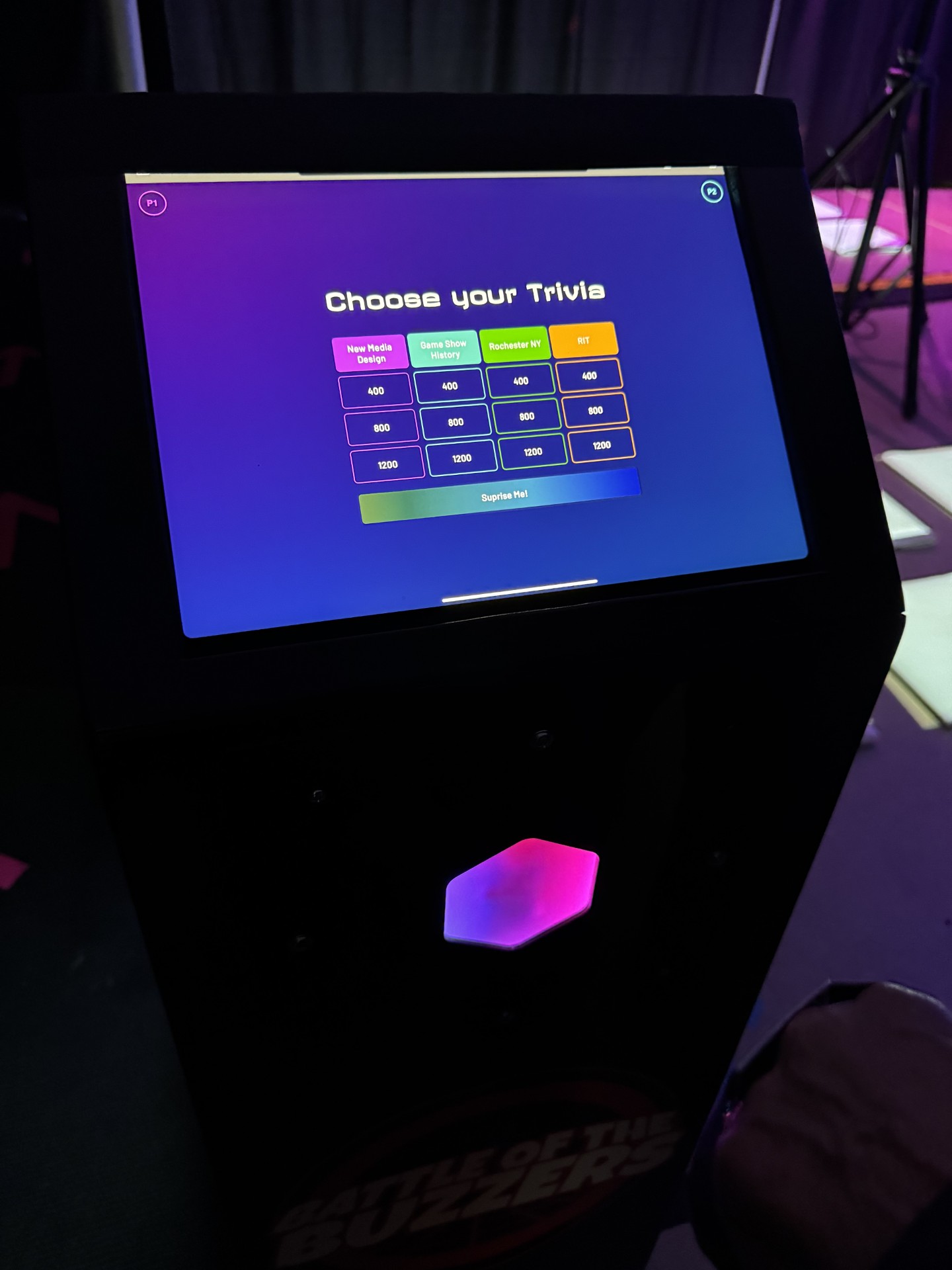
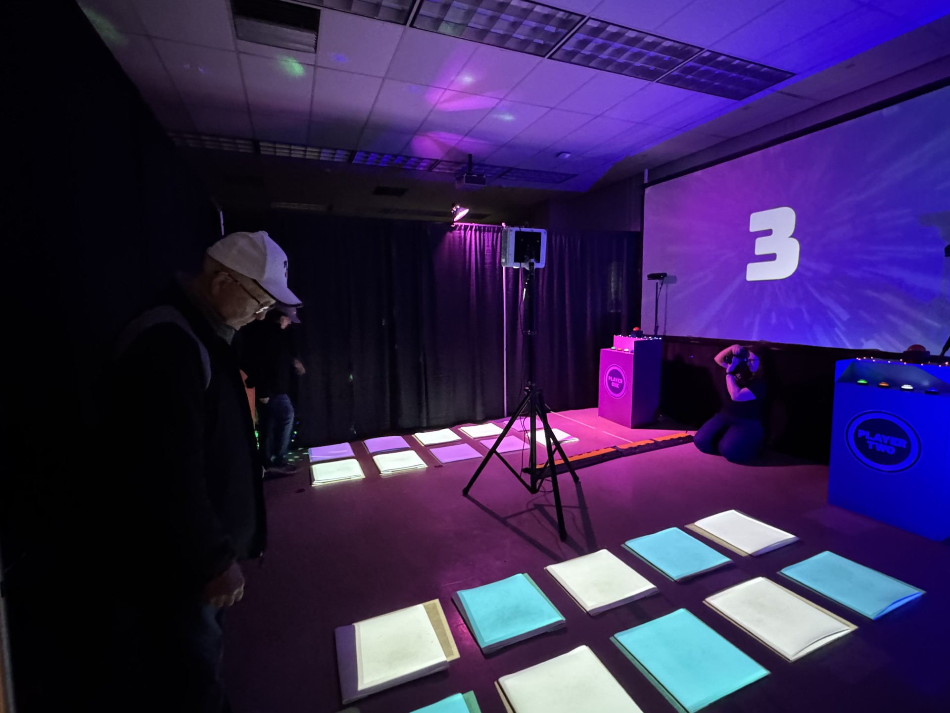
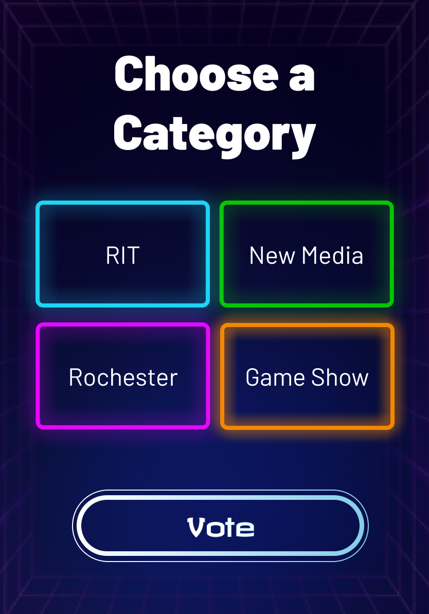
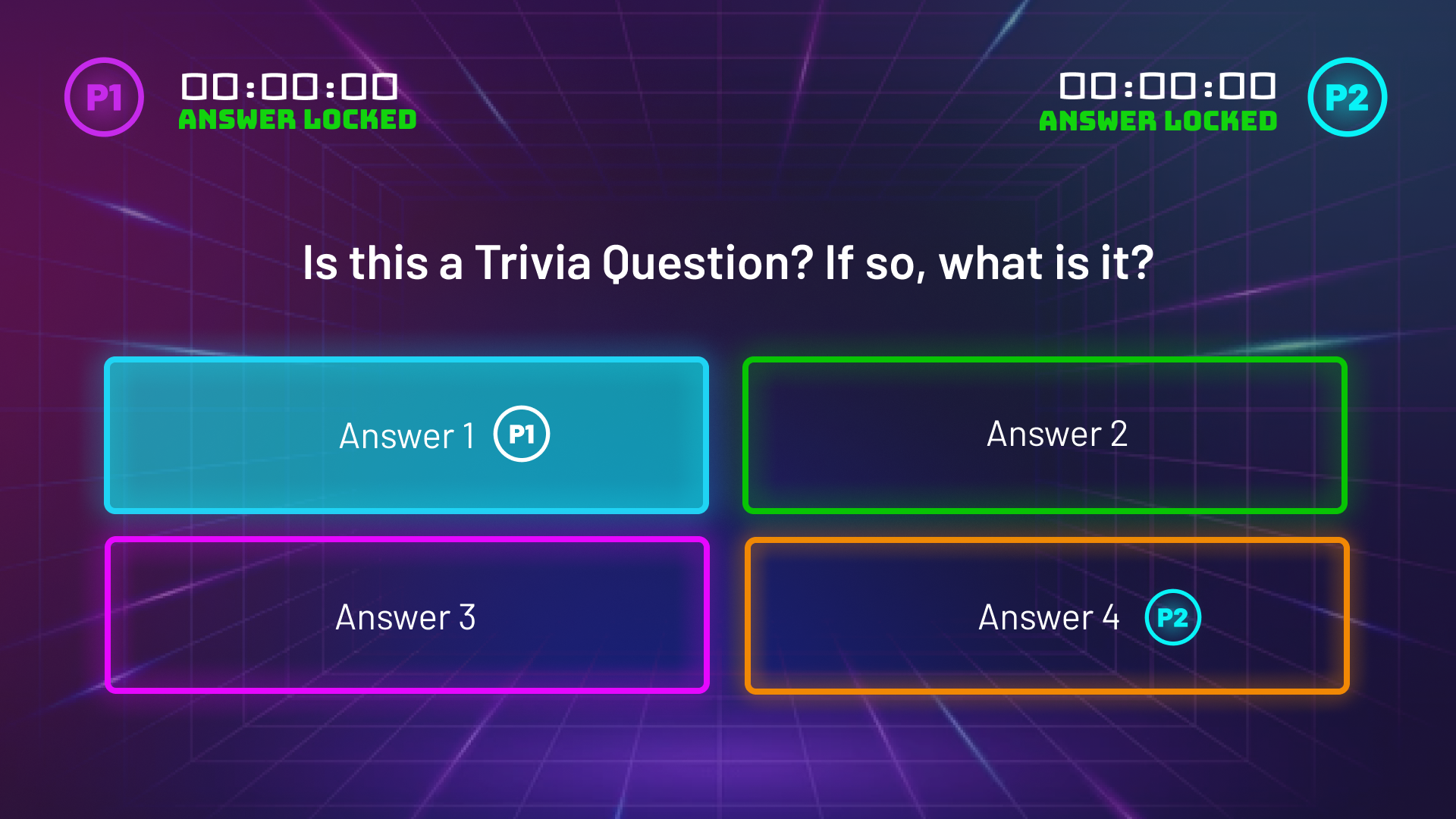
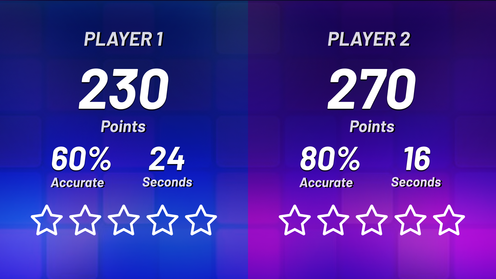
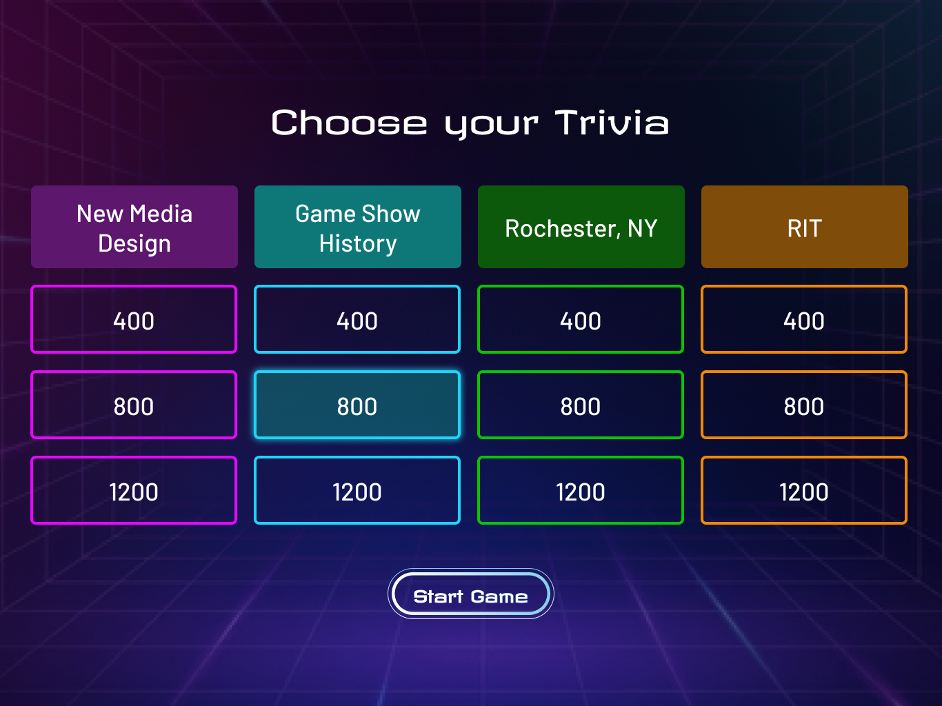
We created a two-part interactive experience that blends projected visuals, physical gameplay, and digital feedback. Guests navigate a pair of light-projected tile lanes by stepping on the correct tiles to advance, mimicking the fast-paced pressure of game show challenges. Upon completing the run, they interact with a themed kiosk where a physical button logs their time and prompts a trivia question tied to the exhibit's subject matter. The UI design was optimized for quick comprehension and high visibility, ensuring smooth participation across age groups. I contributed to the overall visual design of the experience, focusing on the kiosk UI screens, trivia presentation, and feedback systems. The experience supports multiple difficulty levels and integrates with the exhibit-wide scoring system via RFID wristbands, allowing each guest’s progress to be tracked and rewarded.
Objectives
- Design an immersive physical-digital game experience that captures the excitement and interactivity of American game shows while aligning with the educational goals of Beyond the Buzzer at The Strong National Museum of Play.
- Create intuitive, accessible UI and onboarding flows that support a wide age range, encourage quick participation, and maintain a consistent visual language across screens and physical touchpoints.
- Integrate with the exhibit’s RFID-based scoring system to ensure seamless tracking of guest progress, time-based challenges, and trivia performance across the museum experience.
Early Onboarding Wireframes / Visual Designs
Design Obstacles
As we began translating the game concept into a functional physical-digital experience, several design challenges emerged that shaped our approach:
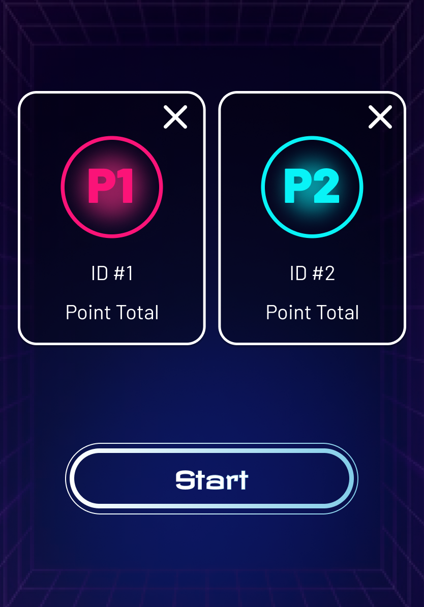
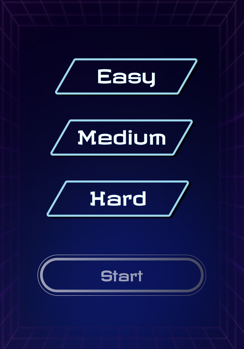
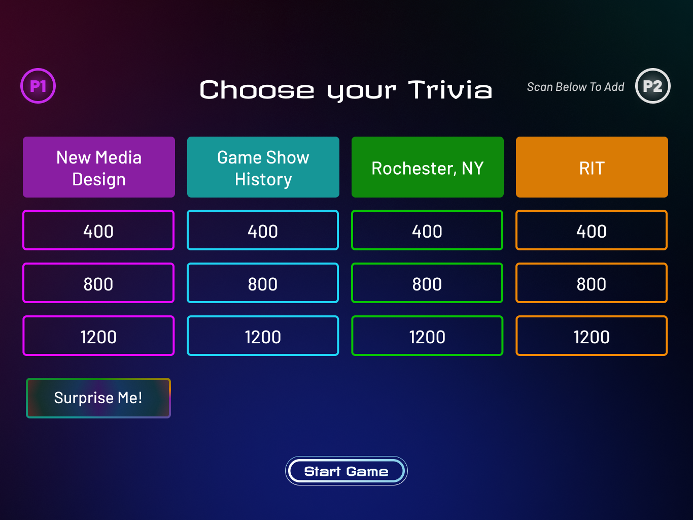
Kiosk Screen Onboarding: The kiosk needed to onboard users of all ages in just a few seconds. The biggest challenge was balancing clarity with engagement — introducing gameplay objectives, controls, and difficulty selection quickly without overwhelming the user. We had to account for guests who may not be familiar with interactive exhibits, while still appealing to competitive players. This required simplifying visual language, using iconography strategically, and designing with large touch targets for accessibility.
Projected Game Visuals: The projected tile lanes were central to the physical challenge, but we quickly found that visibility, alignment, and pacing were critical pain points. The tiles had to clearly communicate correct vs. incorrect paths in real-time, remain readable under changing lighting conditions, and respond to foot traffic in a satisfying way. Additionally, the screen visuals had to reinforce the game show theme without distracting or confusing the player mid-game.
Consistency Across Touchpoints: Because users transition between physical movement and screen interaction, maintaining a cohesive design system was a unique challenge. We needed to ensure that color palettes, visual hierarchy, and tone stayed consistent from the floor projection to the trivia kiosk UI — all while preserving a sense of game show energy and urgency.
Bridging Physical and Digital Interaction
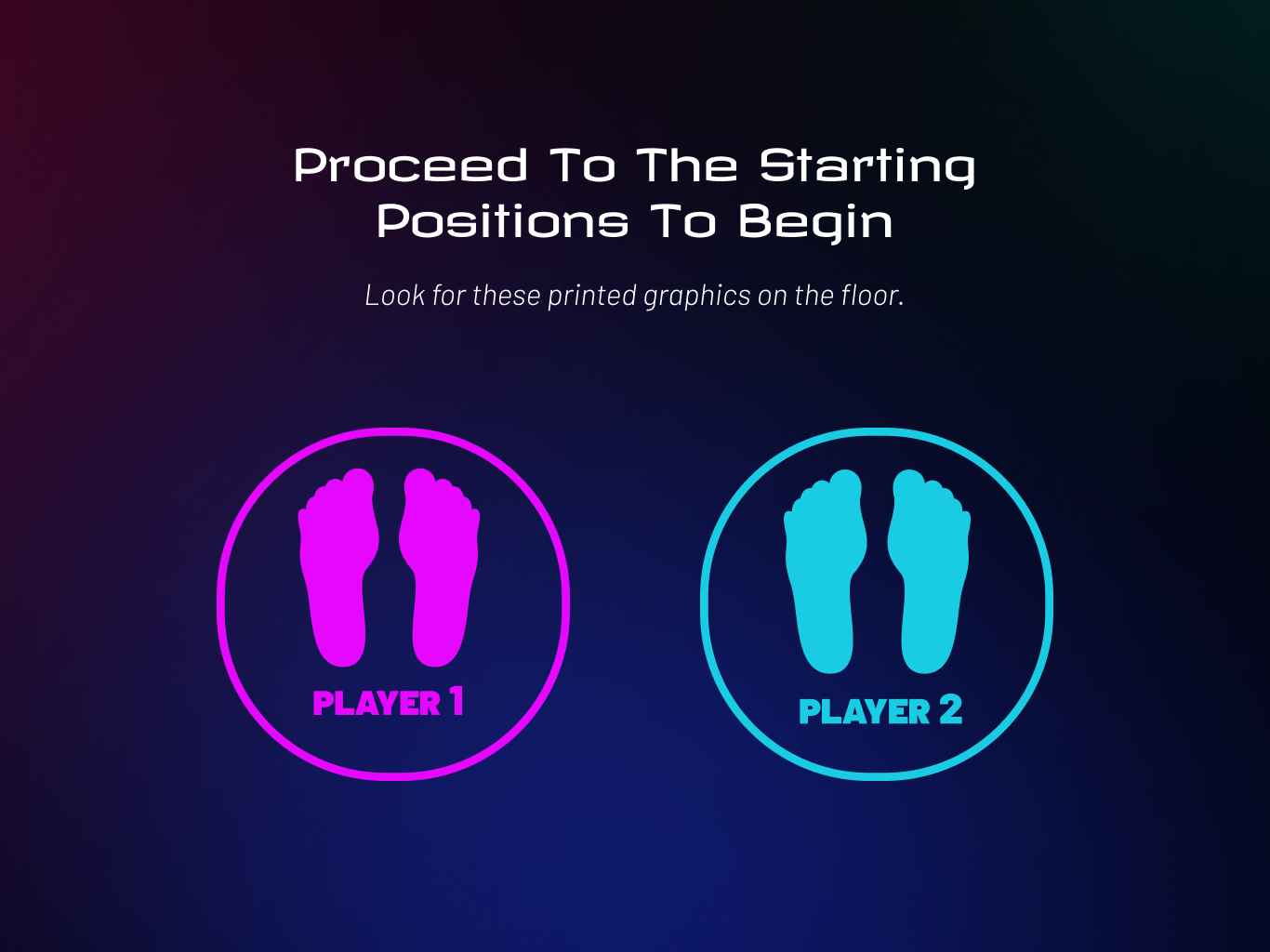
A major challenge in this project was making the physical installation and digital screens feel like a seamless, unified experience. Because players interacted with both a kiosk and a projected tile game, the UI needed to clearly guide them between these elements while reinforcing their physical actions through responsive visual feedback. To support this, we introduced an ending screen in the kiosk onboarding flow that directed players to their correct lane with clear visual cues, ensuring smooth transitions into the physical space. The game also required tight syncing between the UI and backend systems handling RFID scans, lighting changes, and button presses, which meant designing screen states that could respond in real-time and maintain immersion even if there were delays. Spatial layout was also key — screen designs were adjusted to match the physical orientation of each player, and UI elements were placed for ergonomic accessibility, making sure the experience felt natural, responsive, and physically intuitive.
Designing Through Gamification
This project marked my first experience designing with gamification at the core, and it fundamentally shifted how I approached both user interaction and motivation. Unlike traditional UX flows, which often focus on helping users complete clear tasks efficiently, gamification required me to consider how to engage users through challenge, play, and emotional reward. Every screen had to balance function with fun — guiding users through the experience while maintaining a sense of momentum and excitement. I had to think not just about clarity, but also about how elements like pacing, feedback, and visual energy could motivate players to continue, compete, and even replay. This was especially important given the exhibit’s diverse audience, which ranged from young children to adults. Designing for competition introduced new complexity as well; side-by-side gameplay meant the UI had to communicate urgency and progress clearly without overwhelming players or disrupting the flow. I leaned into bold visuals, animated transitions, and straightforward iconography to strike that balance. Overall, working with gamification challenged me to expand beyond conventional user goals and explore how UX design can drive emotional engagement, not just usability.
Some Visual Designs with Gamification Considerations
Final Screens
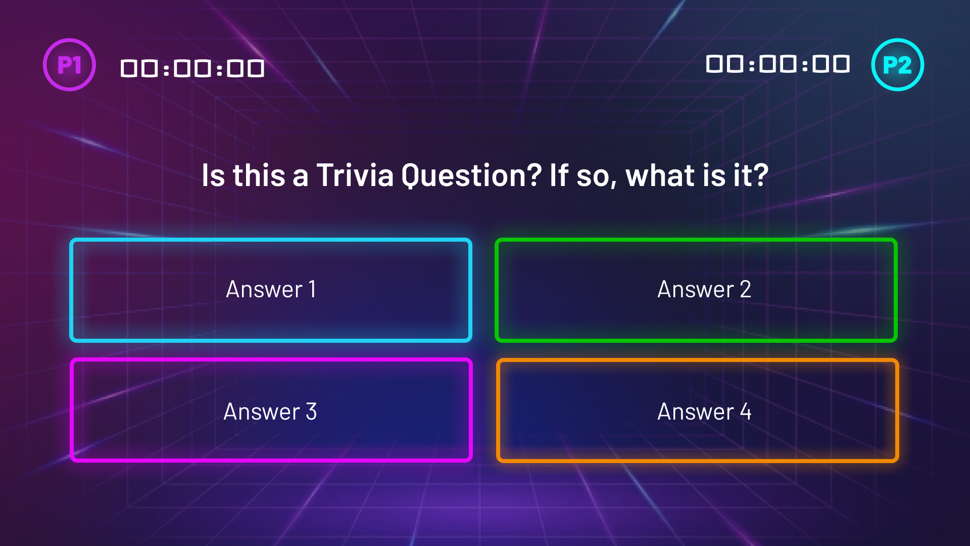
The final screens for both onboarding and gameplay were designed to be bold, intuitive, and thematically aligned with the game show experience. For the onboarding kiosk, we used large, high-contrast buttons and minimal text to ensure that users of all ages could quickly understand their options and start playing without confusion. Visual hierarchy played a key role — difficulty selections were color-coded and supported by icons to reinforce clarity. At the end of the onboarding flow, we added a directional screen that clearly indicated each player's assigned lane, using animated arrows and lane-specific highlights to guide physical movement. The projected game screens were built with visibility and responsiveness in mind. We used strong color differentiation between correct and incorrect tiles, subtle animations to indicate active zones, and a countdown overlay that synced with the lighting system to build anticipation. Together, these screens created a cohesive and accessible experience that emphasized flow, clarity, and the energetic atmosphere of a live game show.
.png)
A Few of the Final Screens
Final Showing
We showcased our interactive game experience at Imagine RIT, a university-wide creative festival that invites the public to explore student innovations across design, technology, and the arts. Our installation was open to all attendees, allowing visitors of all ages to try the game firsthand and experience the blend of physical movement and digital interaction. Representatives from The Strong National Museum of Play also attended, testing the installation alongside the public and providing valuable feedback. Our setup featured projectors on either side of the game lanes to display the interactive tile paths, an onboarding kiosk positioned at the entrance for players to select difficulty and receive lane assignments, and a final projector with button kiosks at the end of each lane for logging times and answering trivia. The event gave us an opportunity to observe how users engaged with the space in real-time and helped us validate the accessibility and clarity of our final design.