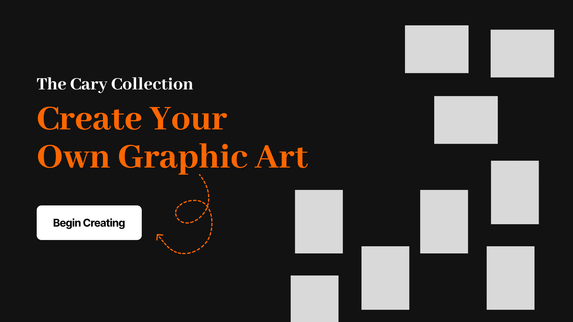
The Living Collection, Reimagining the Cary Collection
Overview
This project was an interactive installation that reimagined the Cary Collection through a modern, digital lens. It allowed users to remix historical imagery and typography into new compositions, bringing fresh attention to archival materials. The experience aimed to make printed history feel accessible, creative, and personally meaningful through digital interaction.
Role
I contributed to the overall visual design and focused on creating a clear, intuitive user interface. I structured and styled many of the HTML pages and worked alongside developers to ensure that the experience felt seamless and responsive across our large touchscreen format.
The Challenge
Despite the incredible historical and artistic value of the Cary Graphic Arts Collection at RIT, many visitors—especially younger audiences—perceive the archived pieces as outdated or irrelevant. The challenge was to reframe these artifacts in a way that invites curiosity, interaction, and creativity in a digital space.
Our Solution
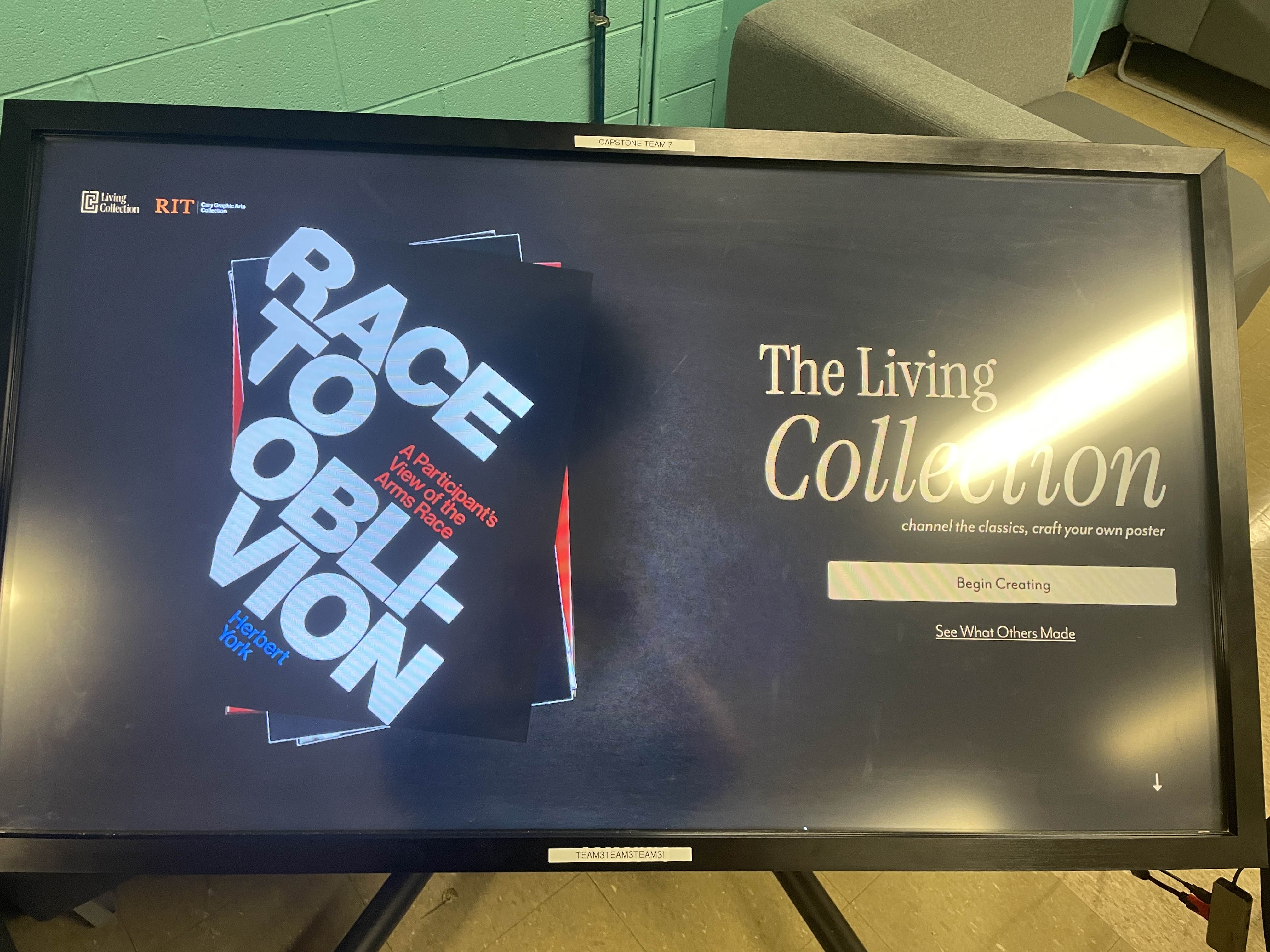
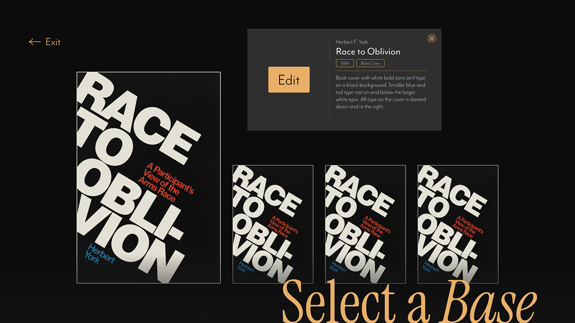
We designed an interactive digital “printing press” that allows users to create visual remixes using real materials from the Cary Collection. Visitors can select from a library of scanned imagery, historic typefaces, and archival color palettes to piece together their own creations— transforming static artifacts into living, shareable art.
Objectives
-
User Creativity at the Forefront
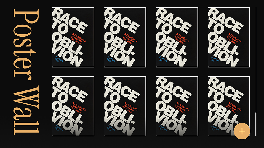
This platform empowers visitors to participate directly in the act of curation. By remixing elements of historical designs, users develop a personal connection with the archive and are more likely to see it as dynamic and relevant. -
Diversity of Pieces
The system is designed to be scalable. As long as a piece contains text or visual components, it can be integrated into the experience. This adaptability increases exposure to a broader range of the collection’s offerings. -
Breathing New Life into the Archive
By enabling reinterpretation, the project shifts how we view archival material—from something to be merely observed to something to be played with and reimagined.
Early Wireframes
Finding Visual Balance
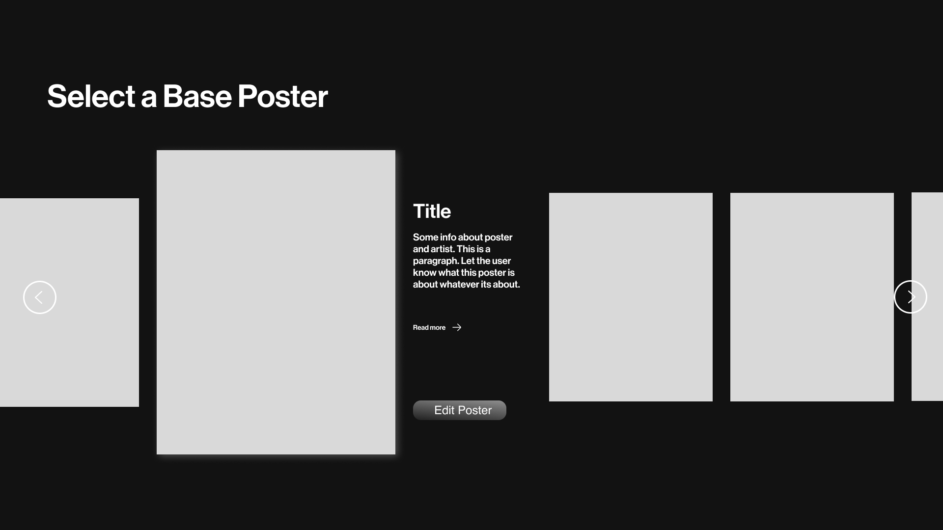
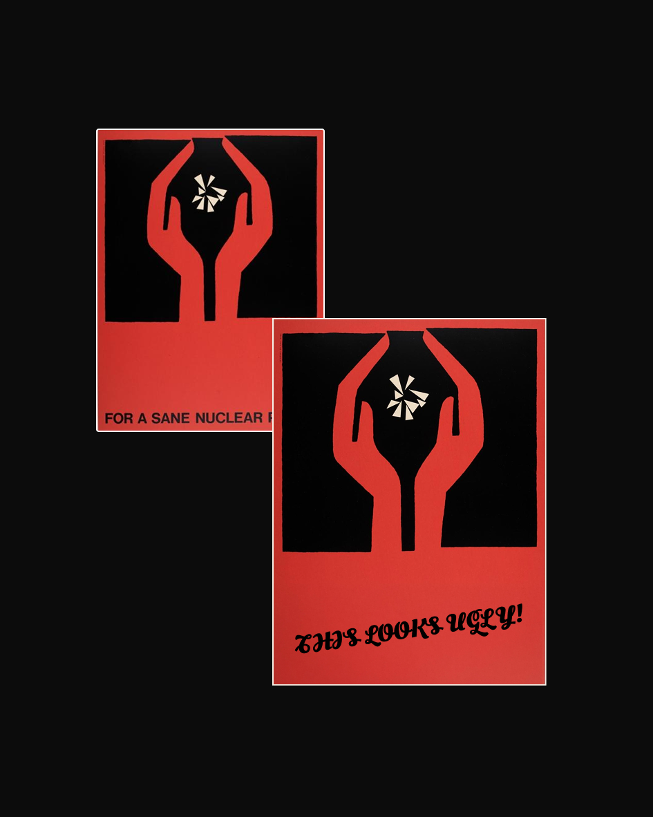
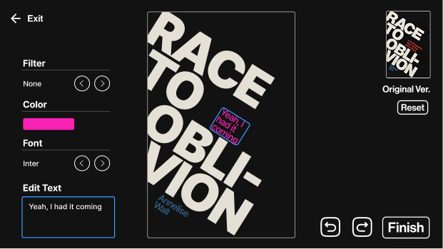
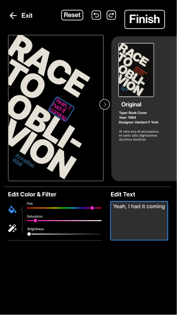
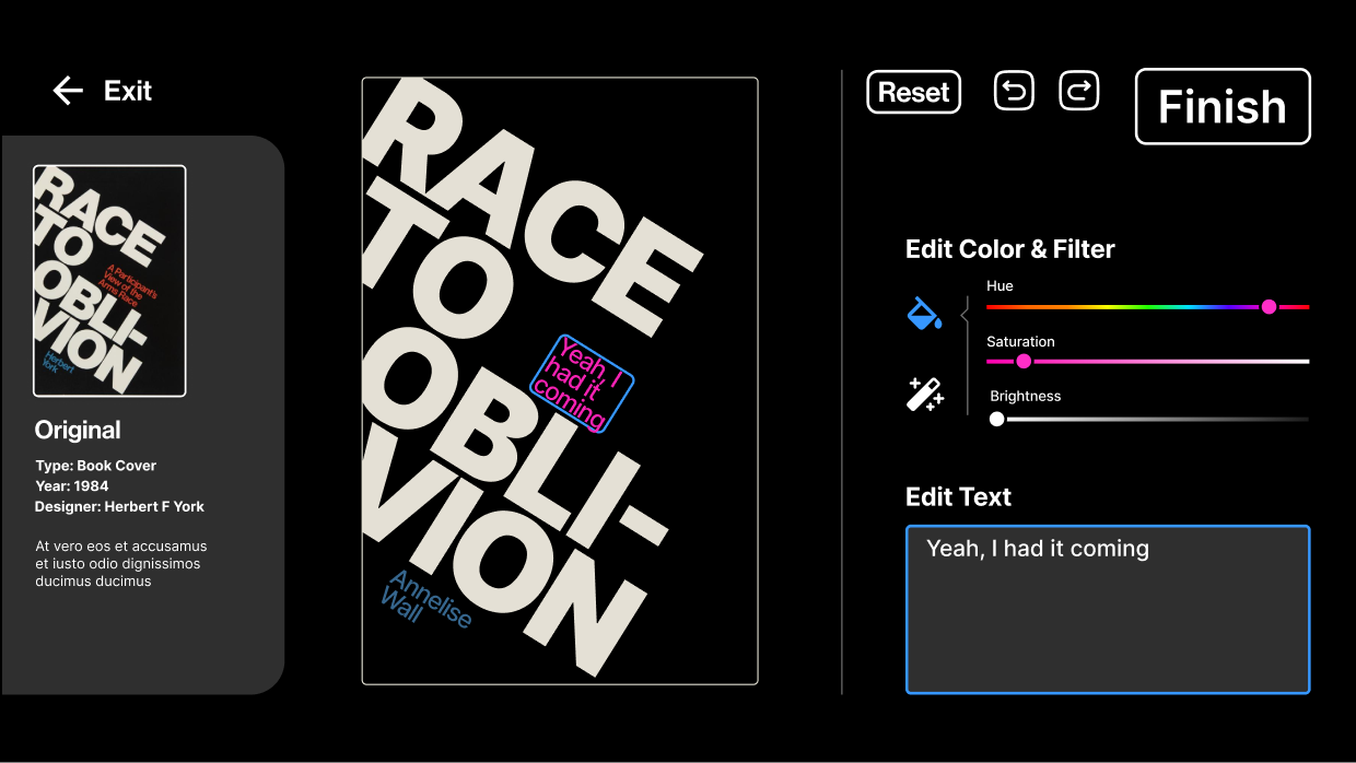
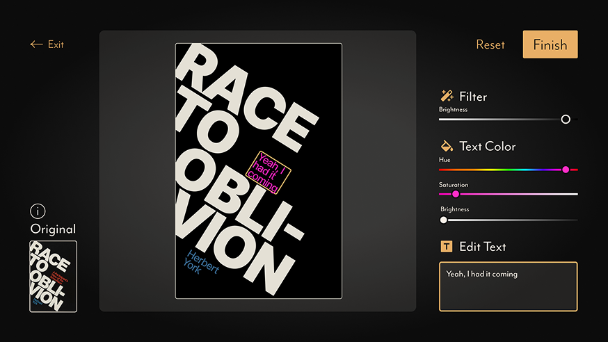
During the visual design phase, one of our biggest challenges was finding the right balance between user creativity and the preservation of the historical identity of each piece. Since our experience centered around remixing archival posters, we needed to ensure that users could engage freely without unintentionally distorting the original intent or aesthetic. We approached this by carefully designing the interface to frame each poster as a canvas, while still maintaining certain fixed elements. In particular, we chose to restrict users from altering the placement or typography of the original text. These components are often central to the visual structure and message of the piece, and allowing them to be moved or changed risked losing the visual harmony and historical integrity. Instead, we directed user customization toward more flexible elements—like color palettes, overlays, and image selections—creating a controlled space for self-expression. This compromise allowed users to feel ownership over their creation while still respecting the spirit of the original designs.
Screen Format & Usability: Designing for a Large Touch Interface
A key part of our installation was designing for a large touchscreen interface, which would serve as
the primary point of interaction for users. Early in the design process, we opted for a vertical
screen layout to better showcase the tall, poster-like proportions of the pieces from the Cary
Collection. This orientation felt like a natural fit—mirroring the original printed format and
allowing the visuals to breathe in a way that felt respectful to their archival source.
However, when we began testing our designs on the actual hardware, unexpected usability issues
emerged. Interactive elements and buttons placed near the top or bottom of the vertical display were
physically difficult for users to reach—especially for shorter individuals or those using the
experience from a seated position. This discomfort disrupted the intended flow of interaction and
reduced engagement.
As a result, we pivoted back to a horizontal layout, prioritizing accessibility and ergonomic
comfort. While this change required rethinking our layout and design systems, it ultimately led to a
more intuitive and enjoyable user experience. We restructured the visual composition to preserve the
emphasis on poster artwork while adapting UI elements to fit a more natural touch range.
This shift emphasized the importance of testing on real hardware—what looked elegant on paper didn’t
always translate to a functional and inclusive experience in practice.
The transition from early horizontal designs to vertical, back to horizontal. (Left to Right)
Final Screens
The final screens featured a modern visual identity that combined clean UI layouts with a refined black and gold color palette. This branding choice helped bridge the gap between historical content and a contemporary digital experience, giving the interface a sense of elegance and clarity. Each screen was designed to feel intuitive and visually consistent, allowing users to focus on exploring and creating without distraction.
 3.png)
Final Showing
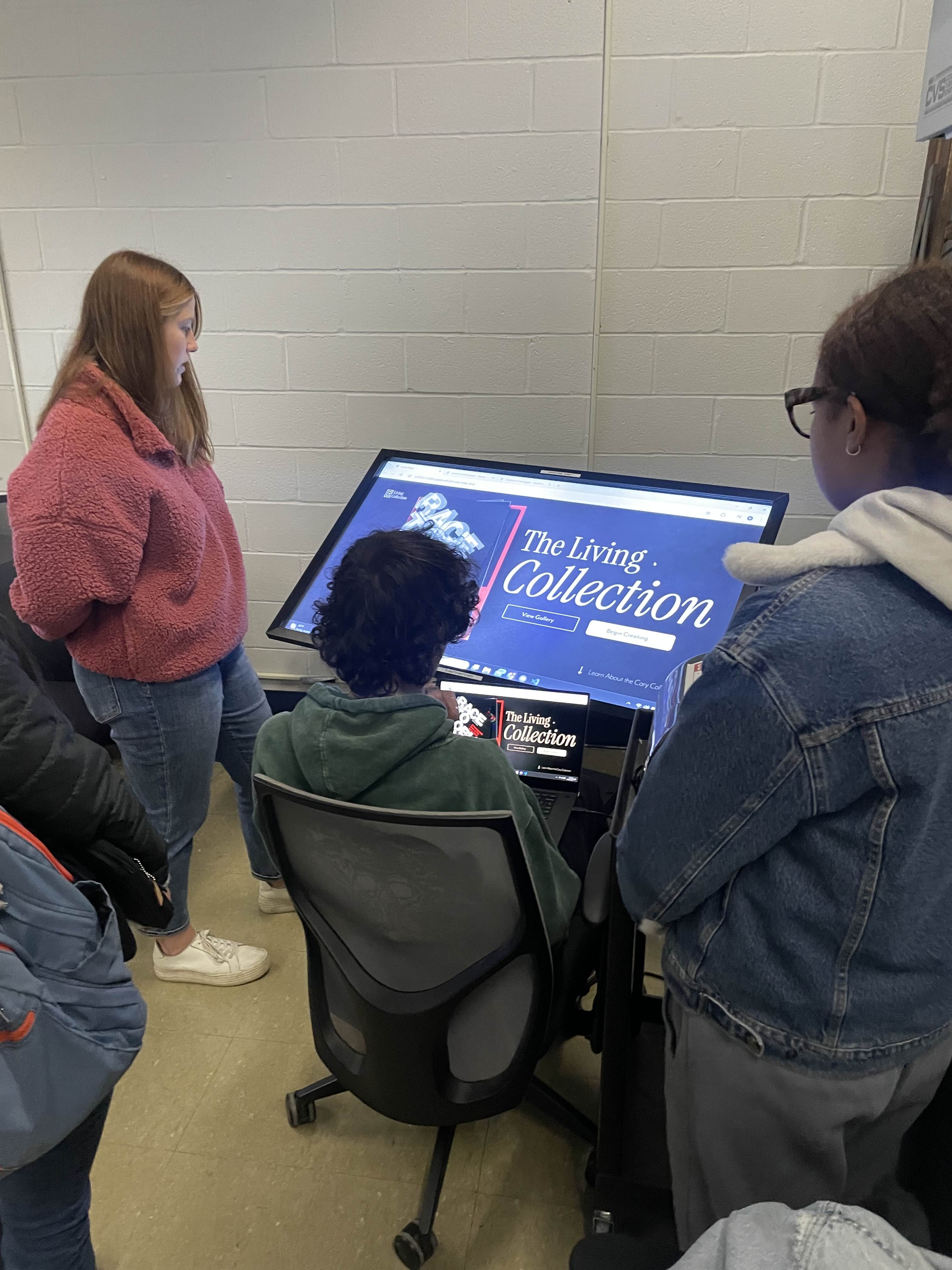
Our final prototype brought the concept of a digital, remixable printing press to life. We presented the experience in a classroom setting to an audience that included fellow students, faculty, and members of the Cary Collection team. Watching people interact with the prototype in real time was rewarding—it validated our approach and showed that archival materials could become engaging and accessible through thoughtful digital design. I contributed to the overall visual design alongside my teammates, and I focused specifically on the UI/UX structure of the experience. I also supported development by building much of the HTML structure and styling the interface to match our visual system. While the prototype was well received, time constraints meant we weren’t able to fully implement our intended visual designs within the functional web-based poster creator. Still, the core interaction model worked effectively, and the experience successfully communicated our concept.